
We continue with the tutorial posts regarding data visualization. The first post was about Volcano Plot and how to interpret (in Turkish). Today, I will share the modified version of one example(original codes are here) I’ve used recently while I was writing a literature review for my research proposal.
mtcars is a very well known dataset used to give example visualizations and analysis in R, however I prefer to use specific hypothetical sample dataset to generate the graph given below. Hopefully it helps you as well. Enjoy with the cool plots!
# First of all, don't forget to set your working directory to the location where your files that you want to work with are located on your computer. Otherwise, you might get an error message specifying that the file is not found. Might be like this:

setwd("C:/Users/USER/Desktop/ResearchProposal")
# Install ggplot2 first
install.packages("ggplot2")
# load the library
library(ggplot2)
# Let's say your file is in txt format, which means they are tab separated, so we will use separator (sep) in \t format
mdata=read.table("methodtimeline.txt", header=TRUE, sep="\t")
#Tip: Let's say your row names have more than one word, and you forget to add separator as \t, you will get an error. Because the default of sep is "", which means a space, so when there is a space between the words of same row, your code is likely to not run properly. So make sure that you use the right separator depending on the file and its format.
#Let's see how this small dataset looks like
mdata
# How does it look like when you call it:
Methods PubDate log10ofCellCount Type DetectionLimit
1 et han al 1/1/2010 0.7 siRNA 200
2 met et al 1/2/2012 2.4 siRNA 300
3 isop et al 1/3/2016 1.8 siRNA 20
4 T et al 2/1/2014 1.9 tRNA 25
5 ABC et al 2/2/2017 2.3 siRNA 3500
6 XYZ et al 2/3/2011 1.5 tRNA 45
7 X et al 3/1/2019 3.8 siRNA 1
8 Y et al 3/2/2021 1.2 siRNA 100
9 Z et al 3/2/2021 2.1 piRNA 40
# or
View(mdata)
# I will call the data from my computer. However, since it is a small dataset, you can generate on your computer and run it on your computer as well. Just make sure that you call with the name you use for the file.# Let's give the row names
rownames(mdata) <- mdata$Methods
mdata<-mdata[,-1]
# Then let's look at the data once more
mdata
# Did you notice anything different? YES, the row names!
PubDate log10ofCellCount Type DetectionLimit
et han al 1/1/2010 0.7 siRNA 200
met et al 1/2/2012 2.4 siRNA 300
isop et al 1/3/2016 1.8 siRNA 20
T et al 2/1/2014 1.9 tRNA 25
ABC et al 2/2/2017 2.3 siRNA 3500
XYZ et al 2/3/2011 1.5 tRNA 45
X et al 3/1/2019 3.8 siRNA 1
Y et al 3/2/2021 1.2 siRNA 100
Z et al 3/2/2021 2.1 piRNA 40
# Let's learn little more about our hypothetical data and our aim by the plot we want to generate. KNOWING WHAT YOU are DEALING with is one of the most IMPORTANT PARTs of the ANALYSIS. Also the purpose of the analysis...
# So, in this specific example, we want to demonstrate the change of the detection limit and cell throughput for specific set of target RNA types for given publication date of the methods stated by row names (Something similar to Svensson et al. (Nature, 2018): Exponential scaling of single-cell RNA-seq in the past decade).
# Name of the article is given by the first author surnames as row names (Methods), publication date is specified in the PubDate column, cell throughput is given in log10 base (log10ofCellCount), RNA target is given in Type columns, and number of given RNA type detected is shared in the column named as DetectionLimit.# Let's start with a basic graph
mdataplot <- ggplot(mdata, aes(x=PubDate, y=log10ofCellCount, col=Type, size=DetectionLimit)) +
geom_point(color = 'red') + #you can change the color of the dots
theme_bw(base_size = 10) #you can change your theme such as theme_classic
# Let's see how it looks like
mdataplot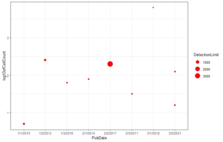
# Let's make it even cooler by adding annotations using ggplot2::geom_text

mdataplot + geom_text(aes(label = rownames(mdata)),
              size = 2.5, show.legend = TRUE)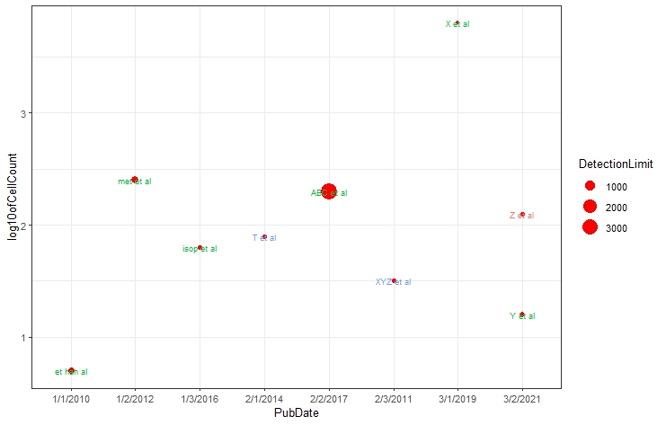
# You can show the legends as well

mdataplot + geom_text(aes(label = rownames(mdata)),
                      size = 2.5, show.legend = TRUE) #by changing the preference #for show.legend=TRUE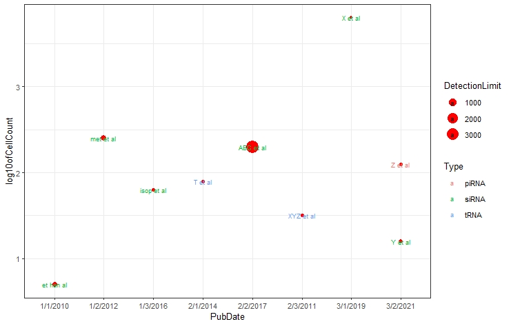
# Use ggrepel::geom_text_repel to add some fancy boxes for the labels

require("ggrepel")
set.seed(13)
mdataplot + geom_label_repel(aes(col=Type, label = rownames(mdata),
                         fill = factor(Type)), color = 'white',
                         size = 3) +
  theme(legend.position = "bottom") #You can adjust the legend position as well
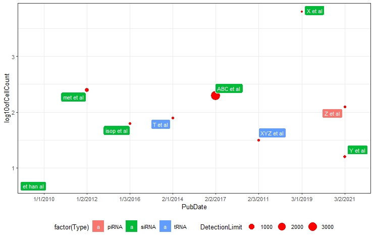
# I personally dont like the red dots and so I will use black dots and change the theme for classic (so there will be no gridlines)

mdataplot <- ggplot(mdata, aes(x=PubDate, y=log10ofCellCount, col=Type, size=DetectionLimit)) +
  geom_point(color = 'black') + #you can change the color of the dots
  theme_bw(base_size = 10) #you can change your theme such as theme_classic

#Let's see how it looks like
mdataplot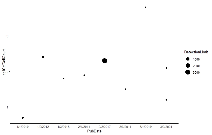
# Let's finalize it by adding titles and relevant axis labels
# Let's use ggrepel::geom_label_repel and change color by groups
mdataplot + geom_label_repel(aes(col=Type, label = rownames(mdata),
                         fill = factor(Type)), color = 'white',
                     size = 3) +
  theme(legend.position = "top") + #let's put the label on the top of the plot
  # add/change the titles
  ggtitle("Cell and RNA Throughput by Method") +
  xlab("Publication Date") + ylab("log10(Number of Cells)") + labs(fill = "RNA Type")

# The size of the points depicts the detection limit whereas the location in the y-axis shows the number of cells sequenced in parallel. x-axis shows the publication date.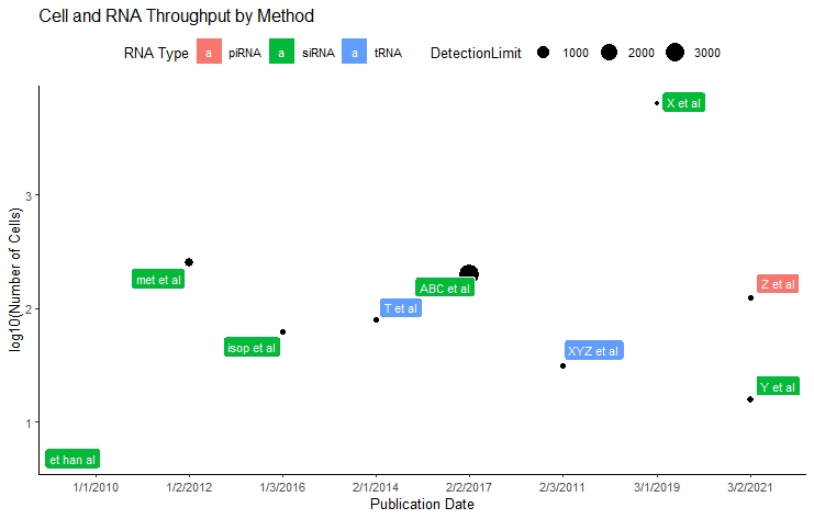
For more information, you can visit these websites:
- https://ggplot2.tidyverse.org/
- http://www.sthda.com/english/wiki/ggplot2-texts-add-text-annotations-to-a-graph-in-r-software
- https://ggrepel.slowkow.com/articles/examples.html
For more of these useful ggplot2 plots:
- http://r-statistics.co/Complete-Ggplot2-Tutorial-Part2-Customizing-Theme-With-R-Code.html
Wanna learn more about the very basics of ggplot2 first, but don’t know where to start? Fret not! Go and check our github page for ggplot workshop (previously given by Melike Dönertaş) .